Architect Gary Gladwish, interior designer Eric Swanson, and Seattle remodeler and home builder Hammer & Hand joined forces to transform a dark and cramped Washington Park home into a bright and airy space. The team worked together to update the home’s kitchen and guest bathroom while gutting the master bathroom to nearly double the footprint of the space.
The kitchen had a good layout, but the countertops and flooring made the space feel unwelcoming.
“The cabinets had been remodeled 12-15 years ago and the layout didn’t really need to be improved,” said Swanson. “But the existing concrete countertops were really dark paired with the dark flooring.”
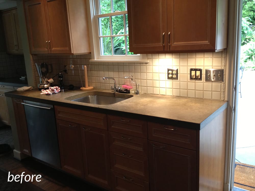
Before photos courtesy of Eric Swanson
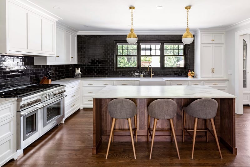
The team took out the chunky concrete countertops and replaced them with a brighter, more contemporary honed Carrara marble countertop. They also replaced the existing tile with a beveled white Neri tile backsplash and took out the cabinets above the sink to let more light in. A Carrara marble tile backsplash above the stove added a more traditional element to the modern design choices.
“The backsplash bridges the gap between the new contemporary countertop and more traditional existing cabinets,” said H&H Project Supervisor Aaron Stevens.
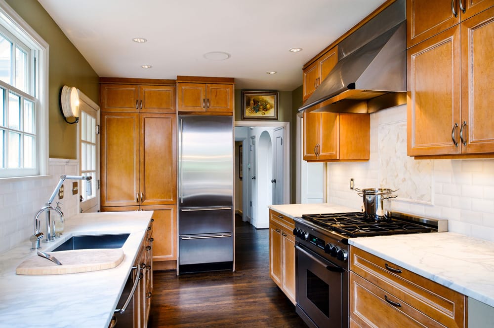
Photography by Will Austin
The guest bathroom was another space that needed some brighter finishes.
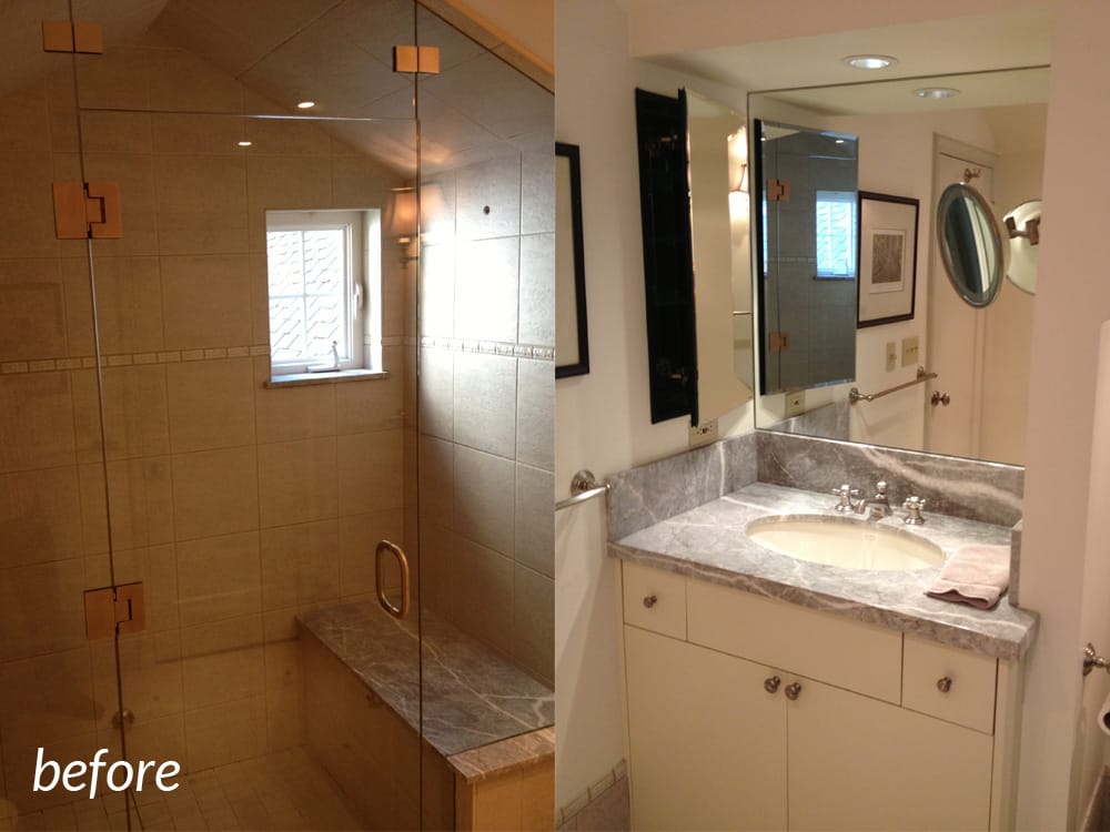
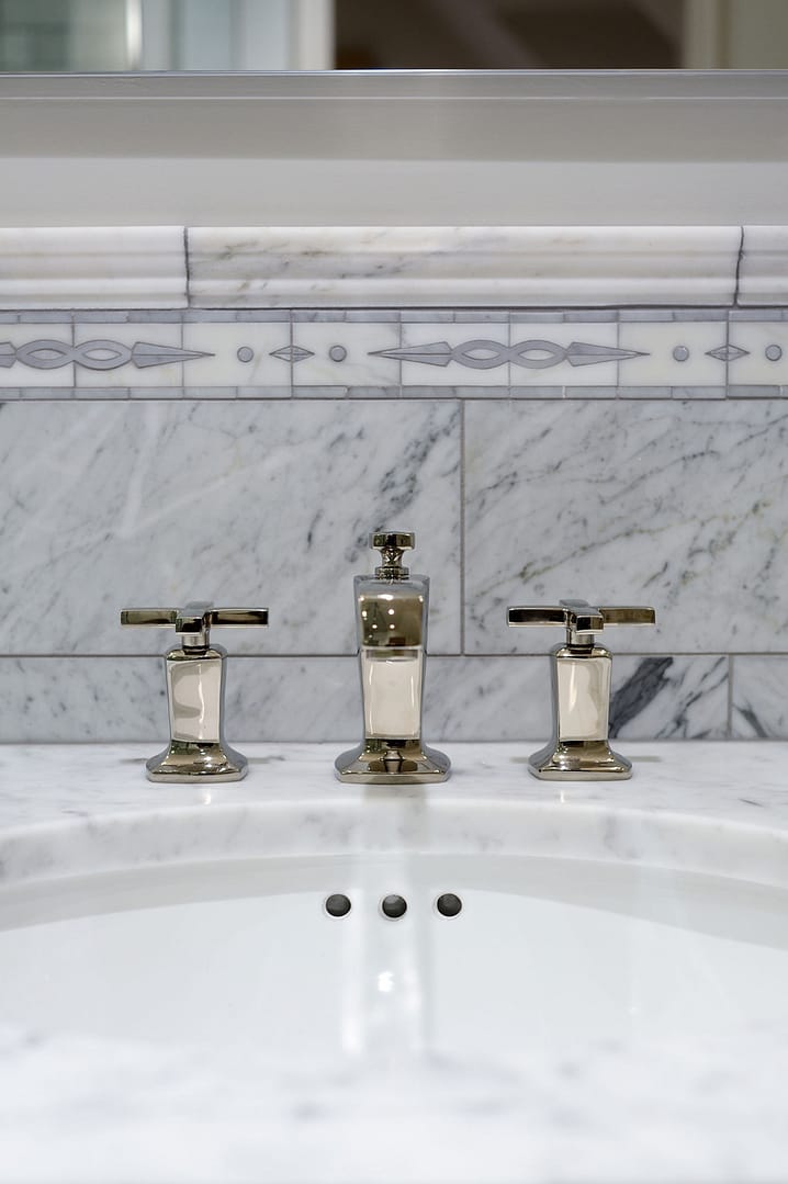
The team kept the footprint the same but added a deep soaking tub and replaced the sink vanity to open the space up visually. Margaux Kohler lighting fixtures in polished nickel brighten the guest bathroom while maintaining the home’s traditional style. Swanson replaced the dark shower and backsplash tile with the same white tile used in the kitchen.
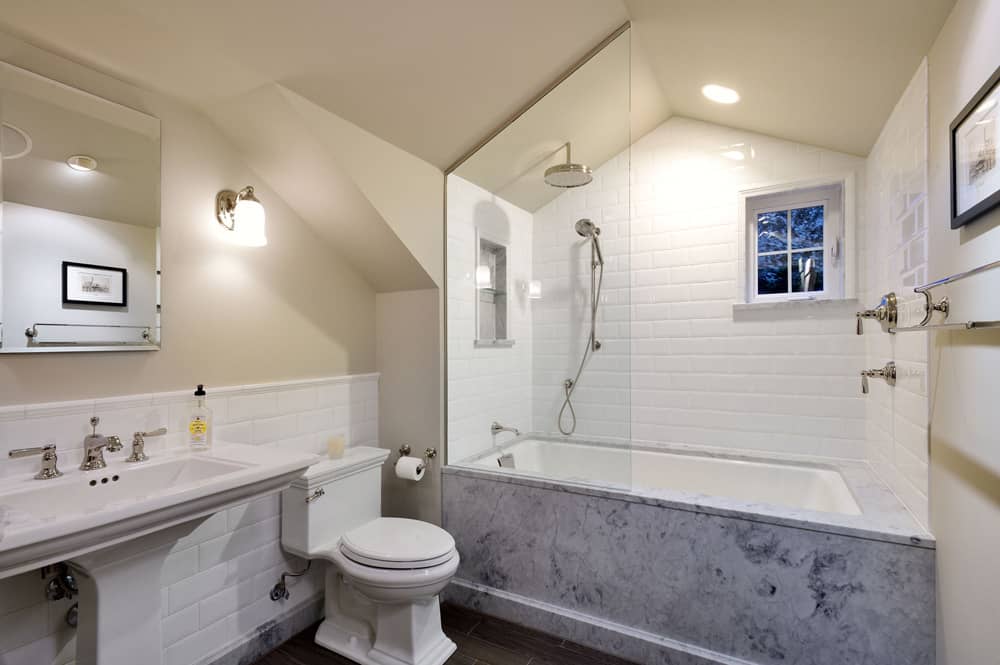
While the kitchen and guest bathroom received much-needed updates, it was the master bathroom that became the jewel of this remodeling project. The existing bathroom was a small, dark, cramped space in a corner of the house.
“It was like a train compartment bathroom it was so small,” said Swanson. “There were three doors in that bathroom – a door to the toilet room, a door to the shower, and a sliding door to enter the bathroom. It was just so claustrophobic.”
The team gutted the existing space, removing a wall and two small closets to almost double the size of the bathroom.
Hammer & Hand Lead Carpenter Jesse Bacon went above and beyond to make the most of the space.
“He saw there was an opportunity to get more light in the bathroom by changing the angle of the roofline. He just took took it back a little more so you can see more light when you walk in,” said Swanson.
Jesse also beefed up the sliding pocket door that serves as the entrance to the master bathroom. “He fixed it so it wouldn’t jiggle and added a soft close to it. He didn’t have to point those things out but he did,” continued Swanson. “He saw the problems and gave solutions for what we could do.”
Swanson chose white tile, a white ceiling plane, marble, and ceiling lights and sconces to create a bright and open space.
“Now it’s a place you want to be in instead of just showering and getting out of there,” said Swanson.
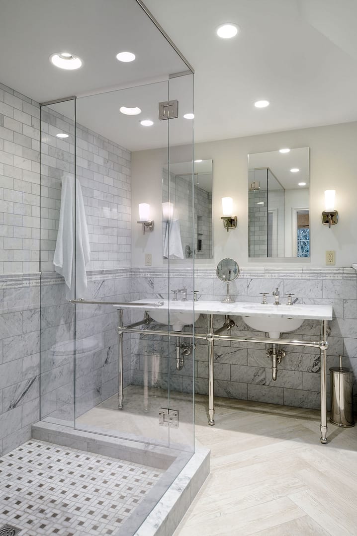
Swanson chose to use a variety of tile to give the space a bright but traditional feel. The herringbone pattern floor tile, Wood Essence in Silver Field by Pental, has the look of wood flooring and ties in with the master bedroom’s carpet. Honed Carrara subway tile gives a classic look to the walls.
“We needed some traditional elements so we got decorative 3 x 12 tile for the back that tied in with the showerpan,” said Swanson. “This detail gives the eye something to land on.”
For more photos of this kitchen and bathroom remodeling project, check out the portfolio.


