Celeste Lewis Architecture and Hammer & Hand collaborated on remodel of the mid-century-modern gem.
EDITOR’S NOTE: At Hammer & Hand we view the “design-build” process as a collaboration between an independent designer, builder and client – so we don’t do design in-house. (Read more about why we think this is the smart way to do “design-build.”) One of the great things about this model of working is that we get to work every day with the region’s architects and designers. Architect Celeste Lewis, principal of Portland-based Celeste Lewis Architecture, is one such collaborator, and today we share her post about the recently completed View-Master House, designed by Celeste and remodeled by Hammer & Hand.
Take it away, Celeste…
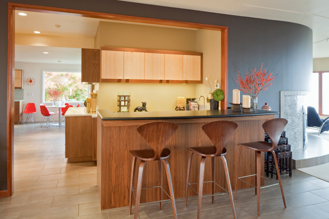
Photography by Sally Painter Photography
Formerly built by the owner of the View-Master toy factory (later Mattel), this house is a gem of mid-century architecture. When I first toured the home, I was drawn to its low-slung pitch, many large expanses of glazing (over 6’x6′) and the view to the east with five enormous windows, faceted, like a View-Master card. From those windows and the entire east side of the home, one has a clear view of Mt. Hood, Mt. St. Helens, the Willamette River, and the Portland downtown skyline.
Unfortunately, the house had been cut up in several areas by remodels performed in the mid-1990’s. The kitchen was small, had no relationship with the knock-out view and was not designed for an owner-occupant cook in mind. Ditto with the master bath: small, with no relationship to the view east.
The circulation was spread out and wasteful. The family entered through a single door in the garage and had no laundry facilities on the main floor. The stair to the lower floor was a straight run that emptied you to one end of the house. And despite the house’s size, there were only two bedrooms on the main floor.
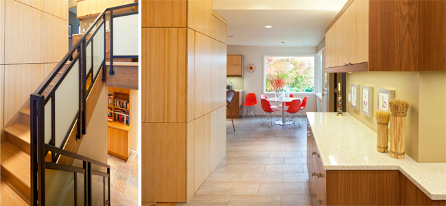
Working over several years and three separate construction periods, we were able to restore a mid-century elegance to the main living areas. We relocated the stair to the lower floor to a more central part of the home, avoiding unnecessary circulation through the kitchen. And to avoid the clutter of stacked daily items in the kitchen, we created a combination family entry/laundry room.
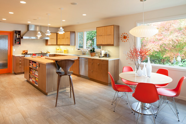
The kitchen moved to the northeast corner of the house to take advantage of the view.
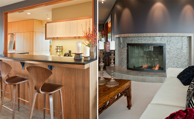
A new wet bar between the formal dining area and the main working kitchen allows the family to separate guests from the kitchen when entertaining, if desired.
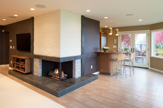
The basement remodel’s rearranged lower floor created space for a small kitchen for out-of-town guests. The family also desired a dedicated workspace for working at home. This new room takes advantage of the eastern view.
Lead Carpenter Abe Sheppard Bloch was instrumental in keeping to the client’s very tight schedule and staying on budget. Given that we replaced all the finishes to be more in keeping with the mid-century vibe and the owner’s impeccable taste, Abe had a tough job on his hands…good design demands excellent execution and Abe executed perfectly.
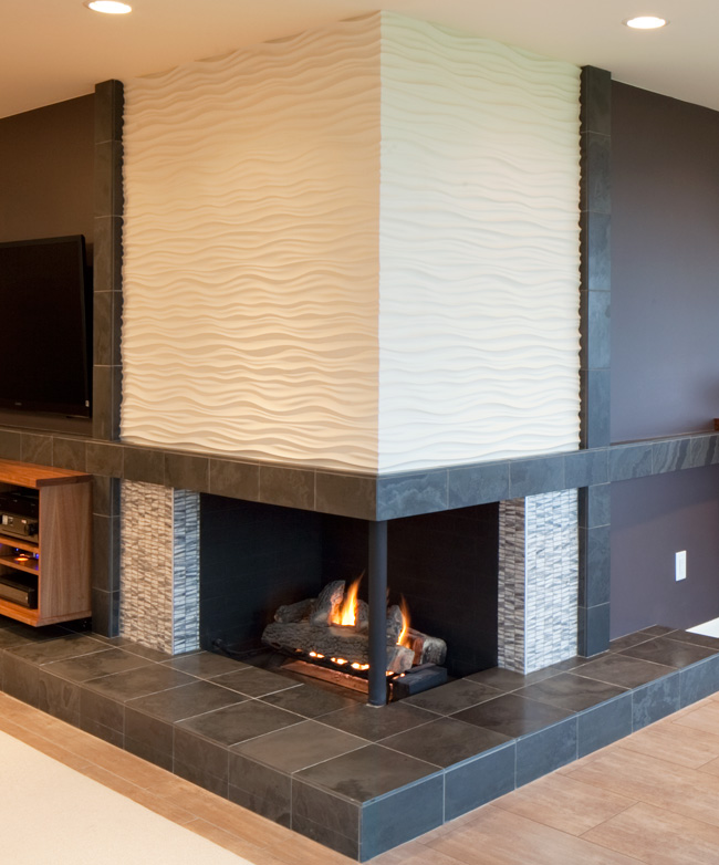
In particular, his attention to detail and craftsmanship ensured that the installation of the wavy plaster tile (pictured above) at the lower floor fireplace was no less than perfection. The grout was sealed and sanded at least 10 times, to ensure the installation looked smooth, not like tiles.
Hammer and Hand ensured the attic and other portions of the job were heavily insulated to offset the energy loss out the original single glazed custom units. That plus the installation of a new energy efficient boiler has brought the house into the 21st century from an energy efficiency standpoint.
Hammer and Hand’s professionalism and attention to the construction side of the process ensured that the final product of our collaboration is art.
– Celeste, Celeste Lewis Architecture, LLC
 Back to Field Notes