Portland design-build collaboration with Steelhead Architecture liberates 1955 bath.
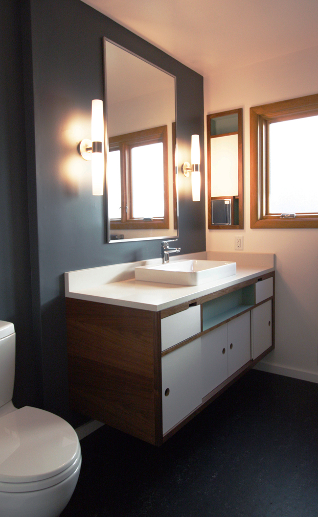 “As a team, we wanted to carve a period bathroom into this very period-oriented home,” explained Hammer & Hand’s Christopher “Coop” Cooper about our recent bath remodel in a 1955 home in Portland’s Dolph Park neighborhood.
While built in the mid-century, the pre-existing bathroom didn’t enjoy the clean lines and elegant geometry that typifies Mid-Century Modern design. And the avocado sink, toilet and tub weren’t what you’d call timeless. They had served a good, useful life. It was time for a rebirth of the space.
The homeowners, one a designer at Nike, care enough about period modernism that they’ll drive across the state for the right piece with which to outfit their home. Mid-Century design is both a passion and a unifying theme in the house.
Gabe Headrick of Steelhead Architecture was a clear choice as designer, with his command of the modern aesthetic. Hammer & Hand’s Patrick Conrad and his team of Jason Woods and Andrew Williamson built the project, with cabinetry and vanity by Big Branch Woodworking.
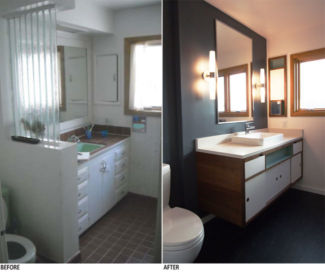
This before/after image (“before” pictures come courtesy of Steelhead Architecture, “after” by bright designlab) shows how Steelhead’s design opened up the space. The vanity is walnut and laminate finish. The floor is marmoleum.
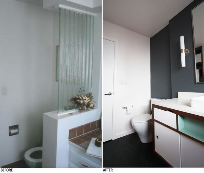
A view across the vanity to the toilet space.
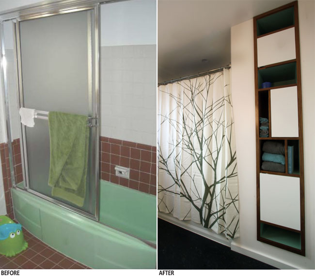
In addition to removing the tub, the team eliminated a soffit that pushed down above the shower/tub. Space for the new built-in shelving and cabinets came thanks to careful resizing of the tub on left and a hallway closet coming in from the right.
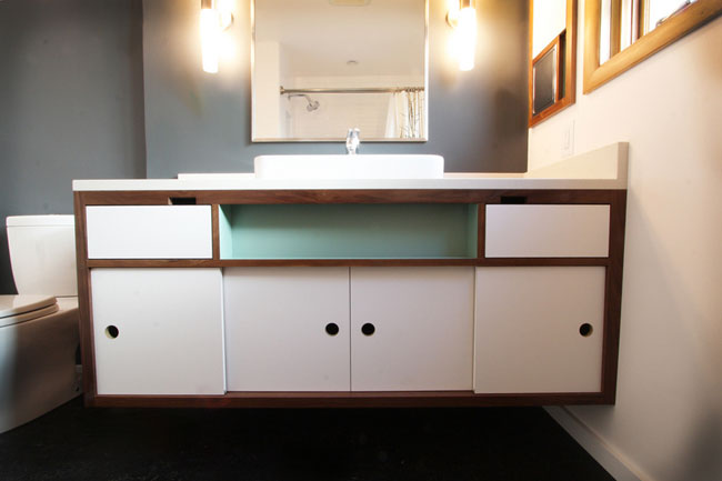
Teal adds a welcome touch of color to a beautifully restrained palette.
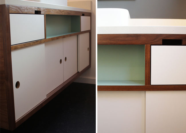
Custom rectangular knockouts serve as drawer pulls, in negative.
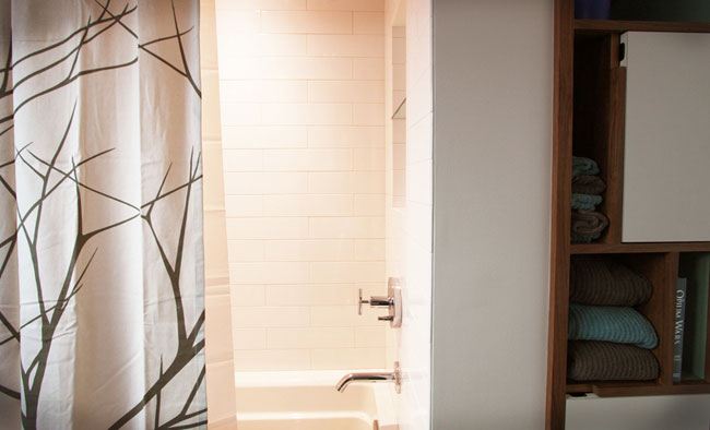
Despite the tub’s reduced footprint (to accommodate the built-in at right), the new shower/tub combination feels more spacious, thanks to white tile and increased vertical space.
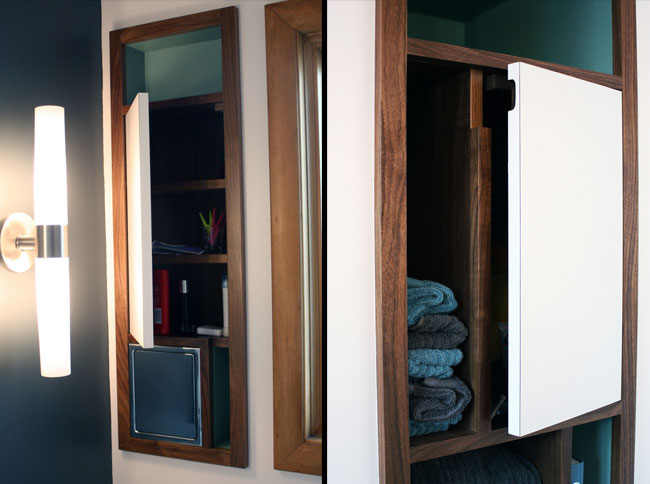
The walnut, laminate, and teal palette of the vanity extends to built-in shelves and cabinets.
This project represents an exemplary application of Mid-Century Modern design, applied in the new millennium, to improve a 1955 home. What a cool fusion of time and aesthetics.
– Zack (Connect with me at +ZacharySemke)
Back to Field Notes