Kitchen remodel wipes away 70s misstep to express Craftsman heritage.
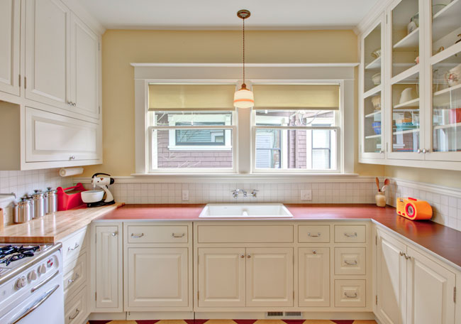
Remodel photography by Mitchell Snyder Photography.
From the moment they purchased the house over a decade ago, the owners of this 1913 Craftsman home in Portland’s Ladds Addition had been planning their kitchen remodel (check out the portfolio page).
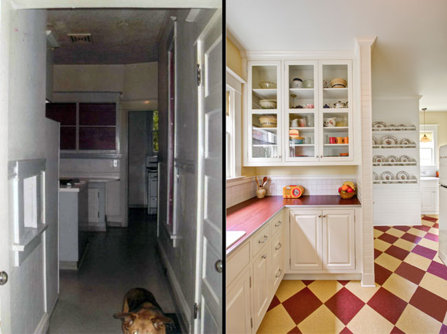
Before/After comparison. (Before photos courtesy of homeowners.)
“It’s a beautiful house, on the historical register in Ladds Addition,” said Alex Daisley, Project Manager with Hammer & Hand. “But it had a non-functioning kitchen in a lot of ways.”
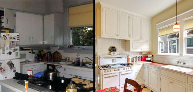
Before/After comparison.
A 1970s remodel had left the home’s kitchen and butler’s pantry oddly cut up and dysfunctional. Expert space planning was in order – but so was a strong re-infusion of design integrity. (More about H&H’s services is at our kitchen remodeling page.)
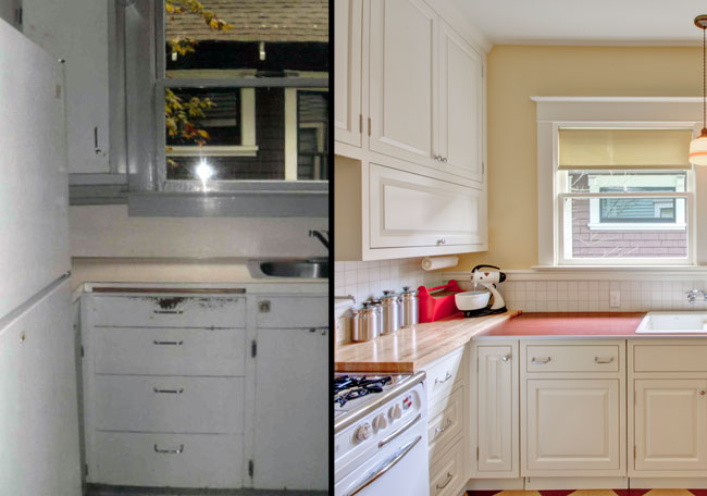
Before/After comparison.
“We wanted to respect the history and integrity of the house, most of which was intact when we bought it,” said David, one of the clients. “To do this we restored the kitchen to the house’s original period. In doing so, it will never go out of style, unlike many contemporary remodels or just nods to Craftsman elements.”
David and his partner went beyond a piecemeal approach and instead hewed closer to the home’s original vernacular, while still creating a functional and modern kitchen.
The clients brought on Kevin Fischer of Alice Designs and Charlotte Cooney of Domestic Arts to execute their vision.
“They were super,” David said. “Kevin and Charlotte were exciting and interesting – great to work with. I had been thinking about the project for 13 years, but was still puzzling over where the fridge should go, for instance. Kevin was a real master of space planning for the kitchen. Both had fantastic ideas, constantly looking at it with a fresh light.”
And the clients brought Hammer & Hand on to build the project, with Alex as project supervisor and Mark Johnson as lead carpenter.
“Mark was no-nonsense about scheduling subcontractors, coordinating Hammer & Hand’s carpenters, and keeping the project moving along,” said David. “He was great at minimizing delays and handling bumps in the road. All the workers were very skilled and hardworking. Not a day went by when someone, somewhere, wasn’t working on something.”
Collaboration among the team members was key.
“The project was a classic example of the great things that can happen when we have really effective collaboration between designer, builder and client,” said Alex.
The client concurred.
“Every Wednesday morning we all met in the living room of the house and went over where we were, what decisions had to be made, and talked about fixtures and details,” said David. “It was really nice to meet weekly and have everybody bring us up-to-date and to make key decisions together. It was really a great working relationship.”
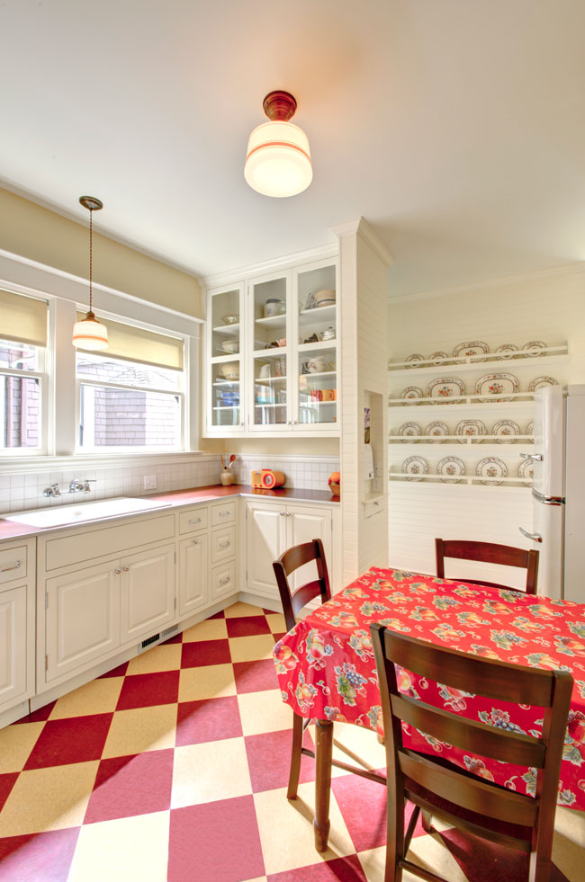
In this photo we see the view of the kitchen from its main entry.
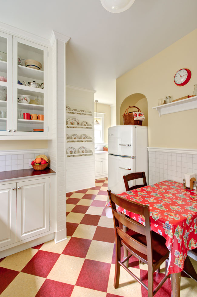
The home’s original kitchen had plaster wainscoting, scored and painted to mimic the look of tile. The 3×3 tile used on the new backsplash and wainscoting is a reference to this original detail, and allowed the team to simplify the number of surfaces employed in the kitchen.
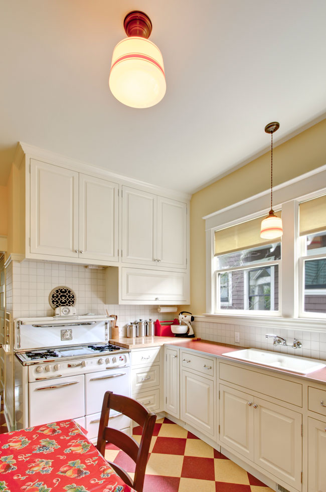
The kitchen’s surface-mounted light fixtures came from School House Electric with shades from Rejuvenation. The light fixture in the butler’s pantry (see later in this post) also came from School House, and its vintage shade was found on the Internet from a dealer in Minnesota. The floor is a classic checkerboard pattern (usually found in black and white).
“It’s an old basic linoleum pattern,” said David, “not a ‘surface du jour’ or trend-of-the-year.”
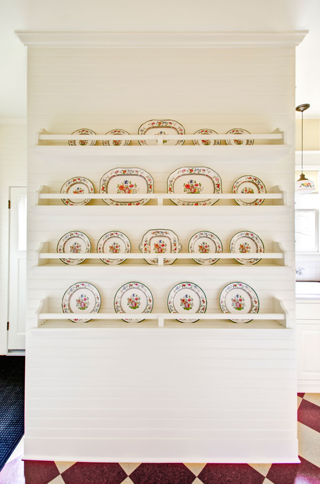
This display wall provides an area for the clients to showcase their heirloom plates. All throughout the kitchen you can find the bead board detail – a classic detail from kitchens of that era. The horizontal orientation of the bead board is unusual, but not historically unprecedented.
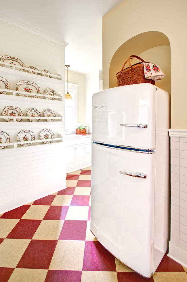
Like the walls surrounding it, the new archway behind the retro refrigerator is made of traditional, silky plaster. “It feels like butter,” according to Alex.
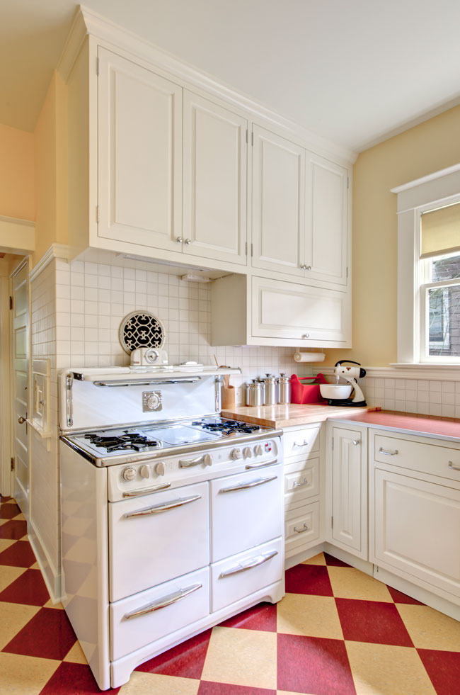
David personally selected all of the appliances – this stove is a refurbished unit from the 50s. Kevin and Charlotte’s designs are built around these pieces.
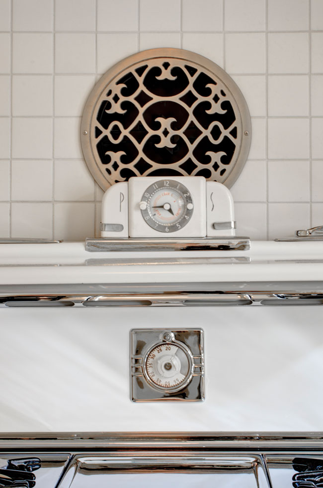
The round vent above the stove, with its decorative grate, is a range hood vent. An inline fan inside the wall vents to the exterior, and works as well as an overhead vent would.
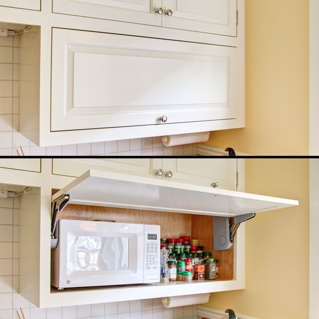
The clients wanted their microwave off the counter and out of site. This custom cabinet fits the bill nicely.
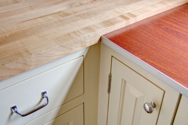
The wood butcher block to the left is maple, treated with a food grade finish. The darker wood is a laminate with an aluminum edge band – a very affordable and period-correct option for this kitchen.
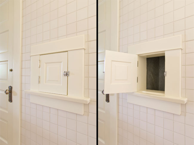
This laundry chute is original to house.
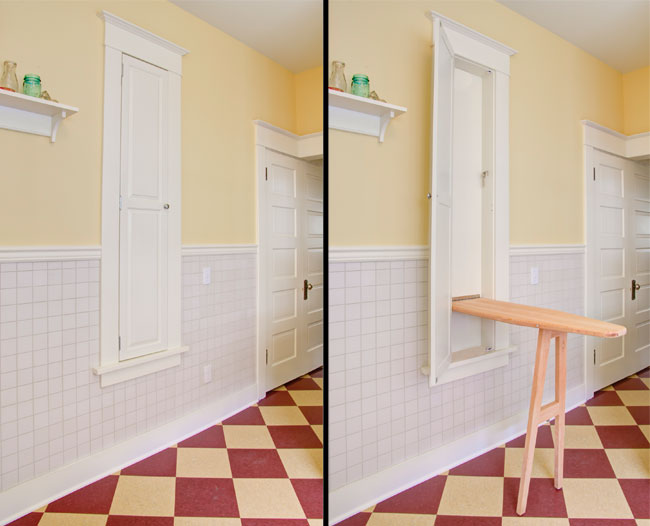
The team also restored the original ironing board cabinet to its former glory. “Hammer and Hand’s Josh Tinker custom built the ironing board – a really fine piece of work,” said David.
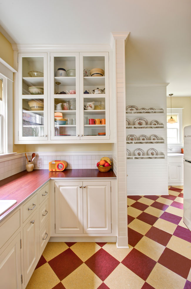
The view above shows how the space flows from the main kitchen, through, the butler’s pantry and to the mudroom and bathroom.
“The 70s remodel had really split these spaces up,” said Alex. “But Kevin’s layout, in partnership with the clients, really managed to open things up.”
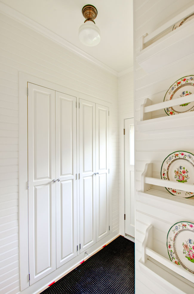
The mudroom’s cabinetry uses the void of an old window for shelving and storage, but without changing the look of the outside of the house. The back door is original, revamped and re-weatherized by our team.
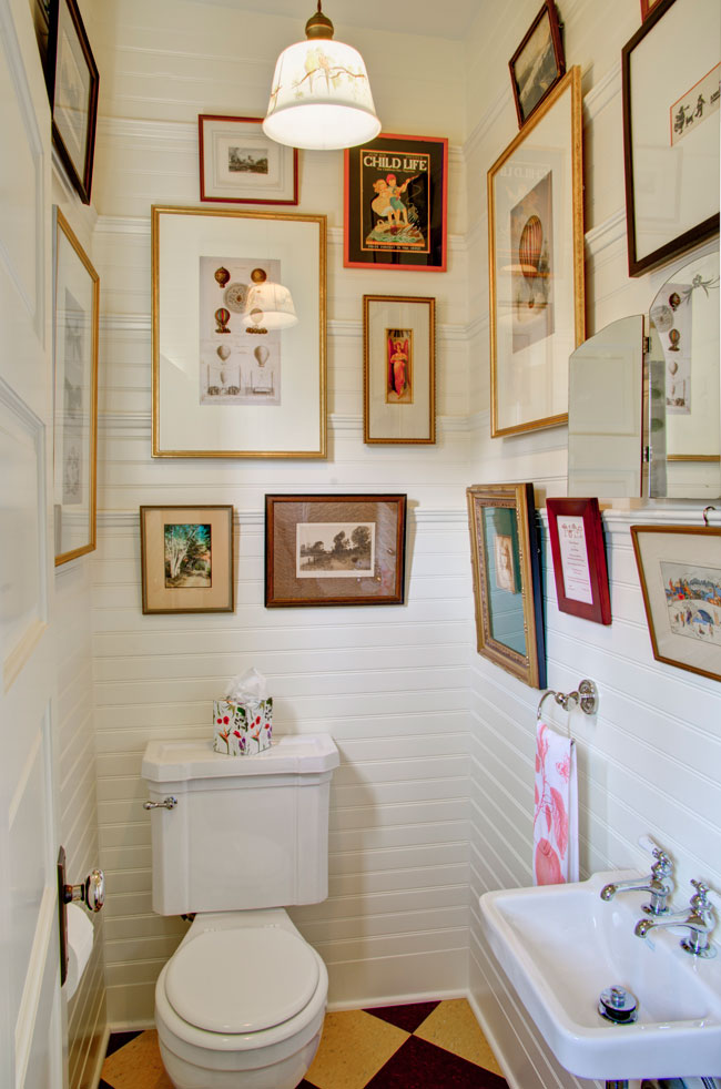
The little bathroom was flipped to accommodate the remodel design, but kept the same basic footprint. The bead board from the kitchen is pulled into the bathroom, and is used as a backdrop for a selection of the clients’ art.
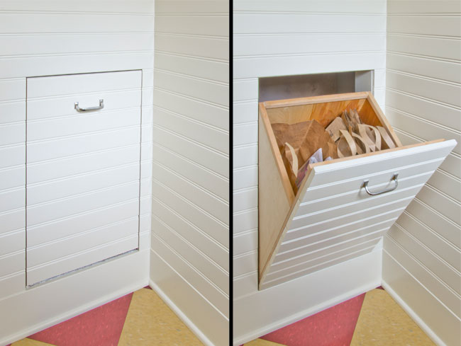
Recycling is tucked away from view.
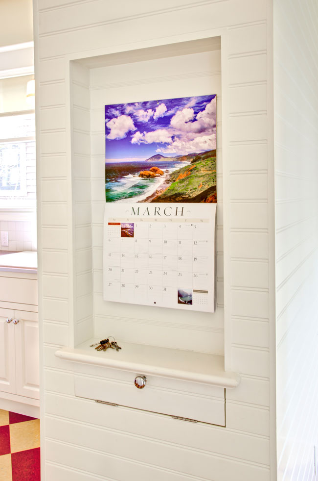
This nook provides an inconspicuous place for the calendar, keys and odds-and-ends.
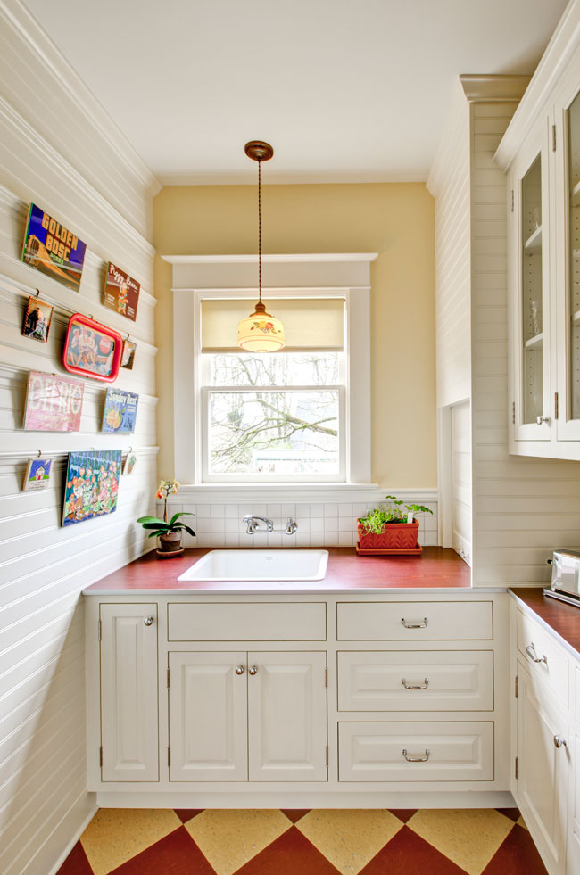
The detailing and surfaces from the kitchen are applied to the butler’s pantry pictured here.
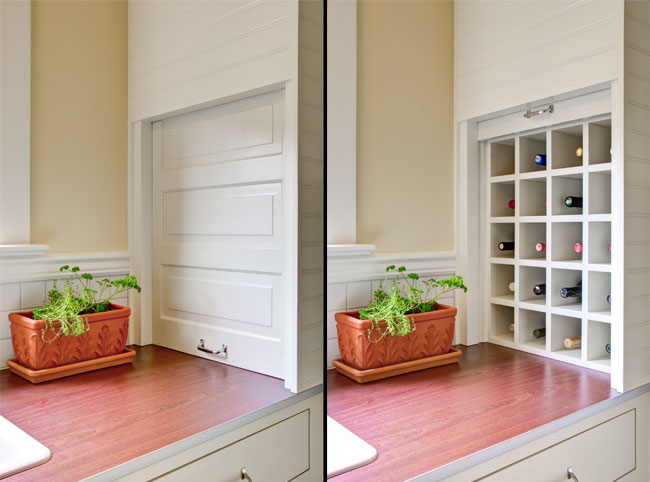
At the counter to the right of the pantry’s sink sits a wine storage cabinet. The door and door mechanism (a pulley, window weight and cord) were salvaged from an old dumbwaiter that we discovered while doing demolition for the remodel and that the team was eager to incorporate into the clients’ new space. The handle is new, matching the rest of the kitchen hardware.
“We are very happy with the product and with the process,” said David. “We had a great experience with Hammer & Hand, enough so that we’ve hired them again for another project.”
– Zack (Connect with me at +ZacharySemke)
P.S.
Have questions about this project? Check out this FAQ post.


