Collaboration between Newspace, Hammer & Hand, and Steelhead Architecture blurs inside/outside distinction.
We at Hammer & Hand love commercial projects. They combine two of our central passions: craftsmanship and business strategy.
When an organization decides to invest in bricks and mortar, it does so to advance its mission and organizational development. It’s a critical strategic decision. As entrepreneurs, we get this, and feel honored to support such mission-critical work when we remodel or build new commercial spaces.
Especially when the business in question is a nonprofit organization of creatives. So we were delighted to be part of the recent transformation of the Newspace Center for Photography’s façade at their newly expanded facility in inner SE Portland.
Newspace has been in the same building since 2002, but last year they doubled their square footage, adding two dark rooms, two digital labs, one light studio, two classrooms, and one gallery to the center. After this expansion, the front of the building wasn’t working anymore.
“Our challenge was to take an Inner SE Portland industrial building and transform the façade to parallel the world-class photography being exhibited within,” said Hammer & Hand Project Manager Christopher “Coop” Cooper.
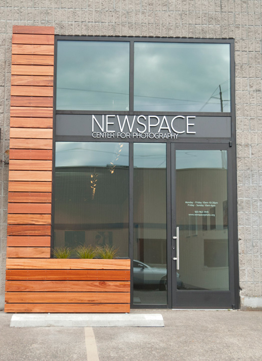 The problem with the Center’s storefront was both aesthetic and functional. An ugly beige garage door dominated the façade and stood as a barrier to the Center’s primary spaces, while a small door to the side served as its “main” entrance. But this entry offered poor access to the Center’s largest gallery space and forced visitors to navigate a maze-like path through the Center.
So the storefront was both a visual and physical barrier, separating the Center from the street outside and, by extension, the larger community. Given that the Center’s mission is to provide access to high quality photography, the group’s leadership knew that this barrier needed to be removed.
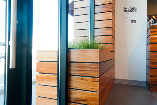
Newspace worked with Gabe Headrick (Steelhead Architecture) and Hammer & Hand to connect inside and outside. Gabe drew up a plan that removed the garage door and replaced it with a glass door and large plane of glass bisecting a tigerwood pillar and planter that stands both inside and outside.
“It’s somewhat ambiguous what’s a reflection, what’s inside, and what’s outside,” said Steve van Eck, Newspace’s Development Director. “The new storefront blurs the distinction between the city and the gallery. At night, when it’s lit up, it’s as if the gallery is another element of the streetscape. The architecture embodies access to high quality artwork for the public.”
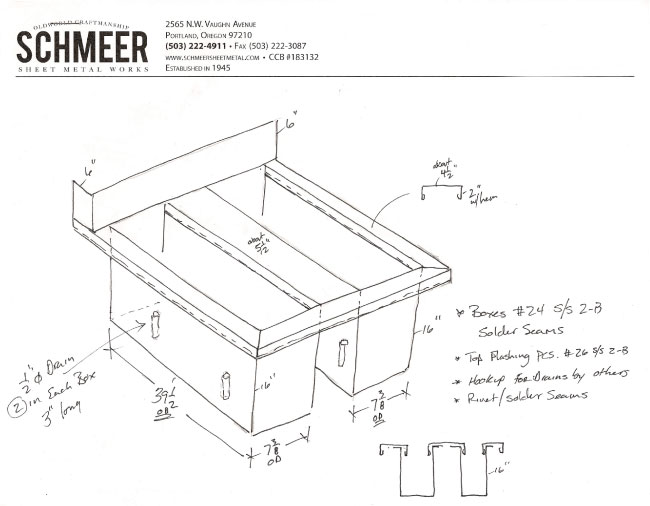 The technical design of the planter was key to the project’s success. We worked with Cedric Meeks at Schmeer Sheet Metal Works to fashion a custom metal planter with a “W” profile, clad in tigerwood. A simple configuration of drains lets water drain from both the inside and outside portion of the planter.
“The overall aesthetic of the façade is very contemporary, clean, sharp, airy and open”, said Coop. One architectural detail that helps achieve this look is the mitered joint used on the tigerwood. We glued and screwed each miter to ensure it maintains its integrity for years to come. And speaking of integrity, we also treated the wood to retard aging from intense sun, given the west-facing orientation of the façade,
Steve had kind words to share about our team of craftspeople, including Coop, Lead Carpenter Patrick Conrad, James Woods, and Josh Tinker.
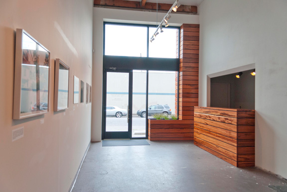 “Working with Hammer & Hand was a real pleasure,” he said. “I personally observed a really high level of craft from all the folks onsite. I talked with everyone on the crew, and to a person they brought high expectations for quality and for the project itself, and an obvious commitment to craft.”
“We work with fine artists here at the Center,” Steve continued. “When they enter Newspace they are entering a place for creative participation, a place to create new work. The high level of craft at the new entryway really sets the tone for creating.”
It’s super satisfying to know that we’re helping support the creative work going on at Newspace.
“I would love to do another project with Hammer & Hand,” says Steve. “I feel very happy about their work and the community loves it. We get a lot of great comments about the work Hammer & Hand did here.”
– Zack
P.S. Photography courtesy of Newspace Center for Photography.
